Blog

The Artwork of Shawn Falchetti
Posts tagged colourfix
Canson Mi-Teintes Touch

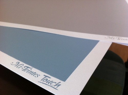
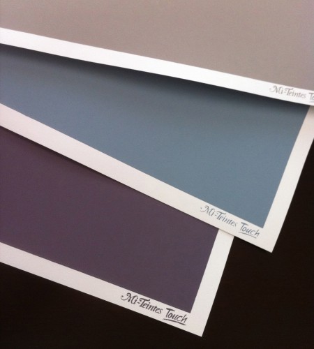
Everyone now and then I like to google "sanded papers" to see if any new products are out.  Most of my artwork is on Artspectrum Colourfix paper, with a few pieces on Pastelbord and Fisher 400.  I've tried UARTs and Wallis, and they didn't work for my style.  I've always liked drawing on the Canson Mi-Teintes papers in the past - especially the multi-colored tablets that give you a variety of hues - but these were textured (but not sanded) papers.  Some colored pencil artists (Sue Obaza comes to mind - check out her work in Strokes of Genius 2) do amazing things to bring out the texture of the Mi-Teintes paper; for me, though, I love the pumice in primer effect of Colourfix, and the speckled finish it produces.  You can imagine my delight when my google search found Canson Mi-Teintes Touch papers.  I had to order some! The Mi-Teintes Touch look and feel very similar to Colourfix.  There is a white, unprinted border around a colored, printed area which is toned with a fine grit sandpaper feel.  The available colors are many of the same colors in the usual Mi-Teintes line up (which is awesome!).  Here's my personal assessment of how they compare side by side with Colourfix:

  • Mi-Teintes full sheet sizes are slightly larger (22" X 30") vs. Colourfix's (18" x 27").
  • Dick Blick's website offered 14 colors for Mi-Teintes, vs. 20 colors for Colourfix
  • For the 3 sheets I ordered (Light Blue, Flannel Gray, Twilight) of Mi-Teintes, the colors were a little more vibrant and saturated than Colourfix colors, which tend to be subdued.
  • The Mi-Teintes papers have the "Mi-Teintes Touch" logo screen printed in the white border of each sheet, while Colourfix borders are unprinted
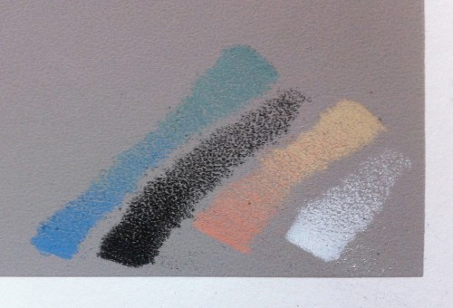
  • The tooth feels similar to the touch between Mi-Teintes and Colourfix.  A few test scribbles showed it to be slightly more prominent in the initial layers than Colourfix.
  • The most striking difference (and this is my biggest complaint about Colourfix in general) is in the overall quality of the screen print area.  The 3 Mi-Teintes sheets all had perfectly rectangular printed blocks of color, with no splatters, no chips, and no irregularities.  The color was uniform in each block.  Running my hand across the surface, the grit was uniform in each block.  From my experience with Colourfix, the variability is high both for consistency of grit and quality of the screen print area.  Some pieces of Colourfix have very little grit, and others are more like sandpaper.  Colors often have splatters and small voids.  The printed edge border is somewhat irregular (which I actually kind of like).  It has been frustrating to buy a pack of Colourfix paper and have every sheet have some type of printing defect, though.  It was nice to have 3 perfectly uniform sheets of Mi-Teintes.  I'll be curious to see if this is the norm with Mi-Teintes as I try more sheets.


Here's a few pics of the sheets and some test scribbles.  Now I just need to figure out what my first project will be!


The Red Room, Revisited

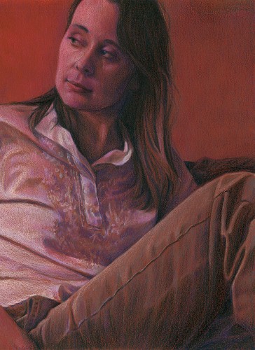
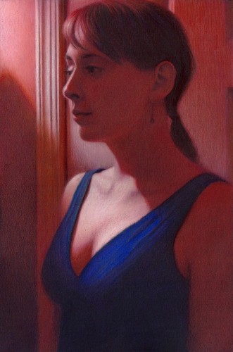
Prismacolor is hosting a contest on their Facebook page, where the grand prize winner may have his artwork appear on one of their 2012 tins. I decided to create a piece specifically for the contest.  A few years ago we did a makeover on a small room in our house, converting it to a den.  The walls were painted a rich terra cotta color, and one of the lamps was red stained glass.  I nicknamed it "The Red Room", and did a piece called "In the Red Room" (12"H x 9"W Prismacolor pencil on red Artspectrum Colourfix paper, 2007).  Earlier this year I was thinking about some ideas for pieces and took a few photos for some poses, and one of these became "The Red Room, Revisited" (15"H x 10"W Prismacolor pencil on black Artspectrum Colourfix paper, December 2011).  Here's a picture of both pieces side by side:

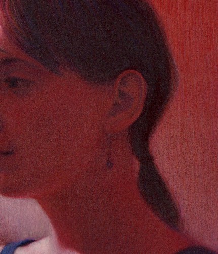
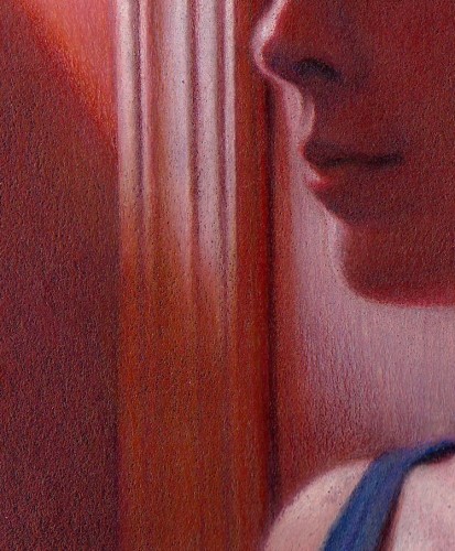
One of the main differences between the two pieces is color intensity.  In the earlier work, I used the red of the paper with some of the darker red and purple colors (terra cotta, black grape) and grayed lavender for the whites.  In the newer piece, I used a fuller range of colors, with complements set side by side.  For example, the reds contain: terra cotta, burnt ochre, parma violet, lime peel, mineral orange, poppy red, and dioxazine purple hue.  Another difference is that last year I was working with Neocolors quiet a bit, and liked the soft edges you could achieve with them.  For the contest, you could only use Prismacolor pencils, but I was still able to create some soft edges only using pencils.  I tried to soften details in shadows, while tightly rendering items in bright light.  A few detail shots:

As an aside, I'll register the standard artist disclaimer that the scan is quite dark and doesn't show all of the colors in the shadows.  Maybe someday I'll figure out the right scan settings to get a good reproduction!

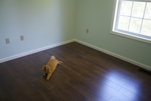
Incidently, these are the last red room drawings because we deconstructed the red room earlier this year, painting the walls blue and installing a dark laminate floor as we converted it into a nursery.  Maybe I'll have a new series, "In the Blue Room"?

Workshop Prep

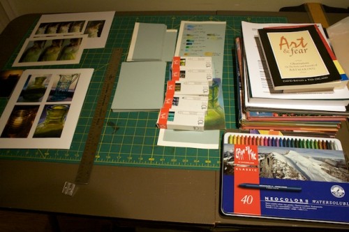
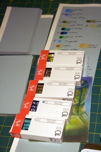
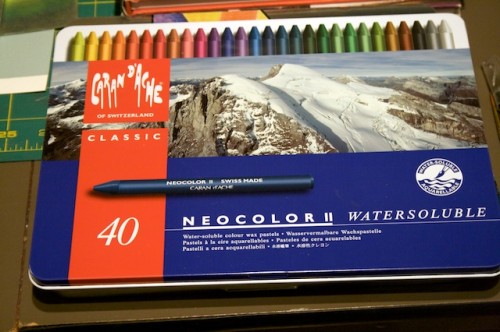
This Saturday I will be giving a workshop for CPSA DC115 titled "Evoking Mood with Neocolors and Colored Pencil", and I've got an area in my studio filled up with all my prep materials.  Like laying out pieces prior to a show, it's always fun to see everything all at once, together.  Here's a few snapshots:

Finished - 4/21

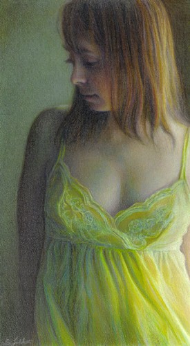
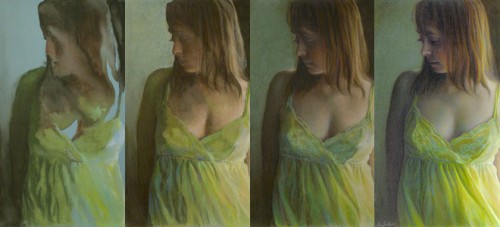
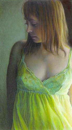
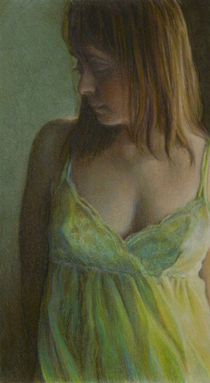
Finished!  Time to complete was 9 days, probably around 30 hours.  After coating the piece with fixative, and letting it dry, I did some color correction throughout, and then final detail work.  I always try to avoid using black until the very end; it's my trump card for values, and once I play it, I can't go any darker.  You can see how the hair has more definition from where the blacks were introduced.  I'm happy with how it turned out - I really wanted something softer, which worked with the waxiness of the Neocolors, to have a more painterly feel to it.  Now I just need to mat it with a backing and place it into a plastic sleeve.  If you like it, you can bid on it at the CPSA Silent Auction, which is July 29th at the 18th Annual International Exhibition in Santa Clara, California.

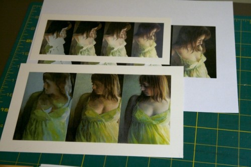
Here's the progression side by side:

Work in Progress Update - 4/19

Picking up some steam, now.  There's a point in every drawing where the hardest parts are done, and you get to play with colors and details.  Feels like I've reached it with this update.  Started to refine the lace, although there's still a lot of color correcting to do there, and some detail work.  Looking forward to dabbling on Tuesday (although it will be competing with my Lost addiction, so I probably won't be as productive!)

Work in Progress Update - 4/18

A couple of hours Friday and Sunday working on color balancing, especially the skin tones, and further refining the face and hair.  Haven't done much yet with the lace - but that will be last so I don't have to rework it several times for color and value balancing.  Starting to come together.  More updates to come later in the week.

Work in Progress - Update 4/16

Still figuring out what I'm doing with Neocolors.  I decided to do a second wash for a few parts, and discovered (unfortunately) that the first wash will come off when rewet.  I completely erased the left arm, as well as some of the darks in the dress!  After some struggling I've fixed the oops, and have been working on getting the values and colors in the skin tones correct.  I find it very difficult to force colors into light Colourfix paper  - I tend to work with dark tones because of this.  Since this piece is on a lighter tone, it's been a wrestling match.  The dress has been the biggest struggle.  Overall it's still on track though - still plenty of color correcting and value building to do.  I haven't done much yet with the lace of the dress, but I'll work on the details once I get the values and color balance worked out.

Work in Progress - CPSA Silent Auction

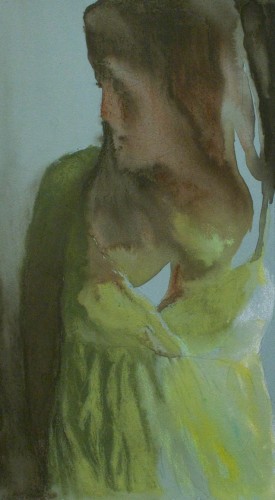
I've been invited to participate in this year's CPSA Silent Auction. Two years ago I also participated, and created a work using one of the alternate poses from the larger piece that was accepted that year. In that case the larger piece was Cascade, and the auction piece was Respite.  I like the idea of doing a sister piece for the silent auction - hopefully this year Opaline Dreams will be accepted, and my auction piece will be the sister piece. Yesterday I started the new piece, which is about 12" x 6" on Fresh Gray Colourfix paper.  After laying down the Neocolor II's, I used a medium sized brush dipped in water to dissolve the pigment.  It's interesting when you lay down the Neocolors in that they're not entirely intuitive; before you hit them with water, they tend to all look similar in hue and it's hard to tell what you'll end up with, especially on Colourfix paper.  Once the water starts flowing though, I love how you can move the pigment around freely, and get some wonderful watercolor-like washes.

Here's the dried work in progress.  I really like the fuzziness of it! In a few parts I left the bare paper show through, because I think it's already the right color. Next step is to start laying down the Prismacolors.  I'll post more pics as I make further progress.

Behind the Scenes - Opaline Dreams

Opaline Dreams was interesting in that it was my first attempt at mixing Prismacolors with Neocolor IIs, which are water soluable.  Neocolors look much like a Crayola crayon when you hold them (although they are still considered a colored pencil - imagine the 'lead' of a colored pencil wrapped in paper, instead of wood).  It takes a bit of experimenting on a test scrap of paper to determine the right combination of crayons to achieve your color, especially since, once you wet them, the color will be very intense.  For this piece, I intended to use the Neocolors only for the darks; this was because I really felt the gray green color of the Colourfix paper was a key part of the skin tones and fabric, and wanted it to show through in the lights.  Since Colourfix can be difficult to get a full range of values on, having solid darks on a lighter paper also helped address this. After the Neocolors were laid down on the paper, I brushed water over them and blended them over the paper.  For the darkest area on the right, I used a very small brush and meticulously evened out the tone.  For the hair, and darks on the right, I used a larger brush and more freely 'painted' with the water.  The result was fuzzy, and uneven, which is what I wanted.  It gave the periphery of the piece a softness that was in line with the mood.

The remainder of the piece was straight Prismacolors.  I spent the most time on the folds and lace of the gown, although it was the skin tones that I found to be the most difficult area, since there was a constant push and pull between going too far in one color and not enough in another.  I tend to end up with an unusual mix of colors in my skin tones, and this one was no exception with greens, purples, and creams.

WVAL Colored Pencil Workshop

There was a good turnout for this weekend's workshop at the Wyoming Valley Art League, with 16 members attending. We had time to work with white, red, and black Colourfix paper, and I gave everyone dark green and gray samples to take home. The workshop's title was "Capturing Light with Colored Pencil and Sanded Papers". Here's a snapshot of the main exercise, a rose, done on 4" x 6" black Colourfix: