Blog

The Artwork of Shawn Falchetti
Posts tagged Prismacolor
The Mystery Continues

The last few drawings of mine have ended in small disasters.  After spraying the piece with a moderate coat of Krylon Workable Fixative (which I've been using for years), I've scratched my head and wondered if a gremlin had snuck in, grabbed a red pencil, and run amok on the picture:  an intense, reddish purple had appeared in multiple areas. Since this has occurred in skin tones and hair, I suspected one of the reddish browns was reacting with the fixative and bleeding.  Fixative is part solvent, after all. I slipped on my lab coat (figuratively) and decided to conduct an experiment with a before and after fixative scan. As it turns out, none of my suspects were guilty.  None bled as a result of the fixative.  But - I've always known that my colors darken as a result of applying fixative, so I thought it would be interesting to set the results side by side to see just how much.  The swatches are on Canson Wineless Mi-Teintes Touch paper (my new favorite color!), and the pencils are Prismas (because that's the main brand I use):
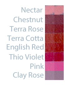
You can see all of the colors darken noticeably, with Nectar and English Red having the least change.  Some of the colors, like Pink, both darken and allow more of the paper color to show through.  Something to keep in mind when applying fixative.

Hopes and Dreams

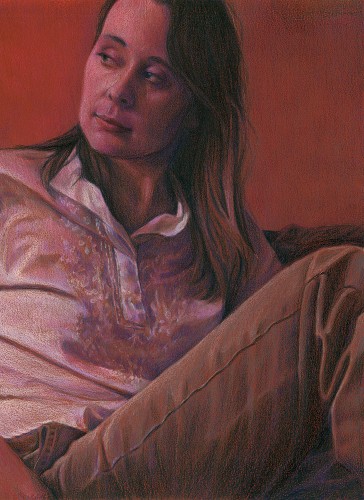
I started my latest drawing before the arrival of my daughter, Emma, and managed to squeeze in some time in the few delirious fleeting moments of free time afterwards to complete it.  Since I planned on entering it as this year's CPSA entry, one of the extra challenges I had was prohibiting myself from using Neocolor II washes to block in the initial colors and shadows.  Actually this was due to my confusion regarding the CPSA's recent rule change which classified Neocolor II crayons as not a colored pencil, making them ineligible as a component of a drawing for the Annual International Exhibition.  I wasn't confused about the rule, but had misread the announcement and assumed the rule went into effect this year, when actually it goes into effect in 2013. I actually could have used them this year for their final eligible show.  Oh well!  On the plus side, my recent entry into the Prismacolor tin contest, which had similar restrictions, egged me on to try and recreate some of the Neocolor effects (such as soft edges) just using blending of colored pencils.  I felt this worked well in this drawing in some of the transitions of the hair and shoulders into the shadows.  Another interesting thing about this drawing was that I purchased and used several of the open stock Caran d'Ache Luminance skin tone colors.  I really love them (although I don't love the price as much - expensive!).  I think they really helped achieve some of the glow you see in the face skin tones.  Now I just need to whisk the final drawing away to Lizza's Studios to have it professionally scanned, then enter it by the end of the month as my CPSA entry.

The Red Room, Revisited

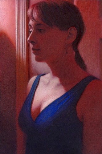
Prismacolor is hosting a contest on their Facebook page, where the grand prize winner may have his artwork appear on one of their 2012 tins. I decided to create a piece specifically for the contest.  A few years ago we did a makeover on a small room in our house, converting it to a den.  The walls were painted a rich terra cotta color, and one of the lamps was red stained glass.  I nicknamed it "The Red Room", and did a piece called "In the Red Room" (12"H x 9"W Prismacolor pencil on red Artspectrum Colourfix paper, 2007).  Earlier this year I was thinking about some ideas for pieces and took a few photos for some poses, and one of these became "The Red Room, Revisited" (15"H x 10"W Prismacolor pencil on black Artspectrum Colourfix paper, December 2011).  Here's a picture of both pieces side by side:

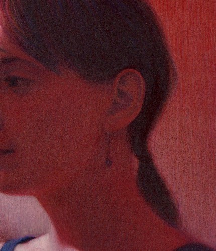
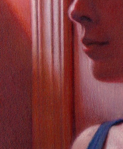
One of the main differences between the two pieces is color intensity.  In the earlier work, I used the red of the paper with some of the darker red and purple colors (terra cotta, black grape) and grayed lavender for the whites.  In the newer piece, I used a fuller range of colors, with complements set side by side.  For example, the reds contain: terra cotta, burnt ochre, parma violet, lime peel, mineral orange, poppy red, and dioxazine purple hue.  Another difference is that last year I was working with Neocolors quiet a bit, and liked the soft edges you could achieve with them.  For the contest, you could only use Prismacolor pencils, but I was still able to create some soft edges only using pencils.  I tried to soften details in shadows, while tightly rendering items in bright light.  A few detail shots:

As an aside, I'll register the standard artist disclaimer that the scan is quite dark and doesn't show all of the colors in the shadows.  Maybe someday I'll figure out the right scan settings to get a good reproduction!

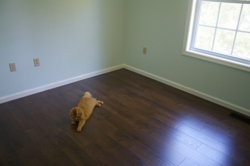
Incidently, these are the last red room drawings because we deconstructed the red room earlier this year, painting the walls blue and installing a dark laminate floor as we converted it into a nursery.  Maybe I'll have a new series, "In the Blue Room"?

Work in Progress - Feb 6

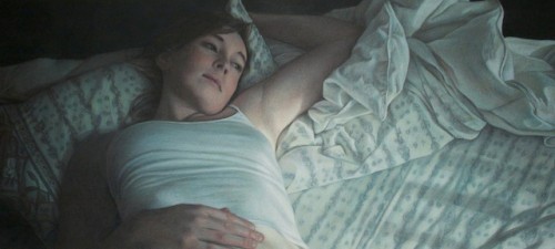
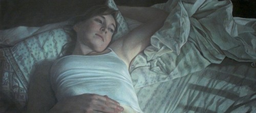
This weekend I turned a corner on the picture, and hit the point where everything is drawn and I can focus on pushing in color and building value.  The pattern on the pillow is still giving me trouble, but strangely the pattern in the sheets is coming together on its own.  I decided to hit the piece with a layer of fixative before continuing work early today, because it was getting pretty waxy and difficult to see how dark some areas were.  I'm always a little nervous about doing that too early, because the paper becomes slicker overall, but it seemed to work okay.  I also encountered the usual paradox where my darks didn't seem dark enough, but in actuality I needed to make all of my lights lighter.

Work in Progress - Jan 30

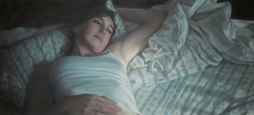
Slow going, but steady progress.  The pattern in the sheet is going to drive my bonkers, but I feel the angles and lines it makes really add to the movement of the composition.  I think I'm happiest with how the hand turned out - I was worried about the foreshortened hand being front and center, but that part went actually surprisingly easily.  The lower right hand portion of the picture still has the least amount of work done, just with blocking and a few glazes of jade green to color correct.  You can see the pattern of wrinkles in the sheets starting to form.