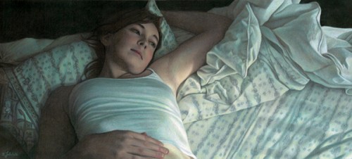
I started my latest drawing before the arrival of my daughter, Emma, and managed to squeeze in some time in the few delirious fleeting moments of free time afterwards to complete it. Since I planned on entering it as this year's CPSA entry, one of the extra challenges I had was prohibiting myself from using Neocolor II washes to block in the initial colors and shadows. Actually this was due to my confusion regarding the CPSA's recent rule change which classified Neocolor II crayons as not a colored pencil, making them ineligible as a component of a drawing for the Annual International Exhibition. I wasn't confused about the rule, but had misread the announcement and assumed the rule went into effect this year, when actually it goes into effect in 2013. I actually could have used them this year for their final eligible show. Oh well! On the plus side, my recent entry into the Prismacolor tin contest, which had similar restrictions, egged me on to try and recreate some of the Neocolor effects (such as soft edges) just using blending of colored pencils. I felt this worked well in this drawing in some of the transitions of the hair and shoulders into the shadows. Another interesting thing about this drawing was that I purchased and used several of the open stock Caran d'Ache Luminance skin tone colors. I really love them (although I don't love the price as much - expensive!). I think they really helped achieve some of the glow you see in the face skin tones. Now I just need to whisk the final drawing away to Lizza's Studios to have it professionally scanned, then enter it by the end of the month as my CPSA entry.

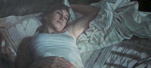
Today I completed "Daydreams", 12"H x 26" W on Aubergine Artspectrum Colourfix paper. Pencils used were mostly Prismacolors, with also quite a few Derwent Coloursofts, and Neocolor IIs used sparingly for the black areas. All of the crazy fabric folds weren't the hard part - I love drawing fabric; it was the sheet pattern which gave me the most difficultly. I think the hardest part of the pattern was figuring out where to suggest it, and where to actually render it. I was worried that if it was too tightly rendered, you might end up looking at it instead of the figure. The other challenge was keeping the piece from turning too monochromatic. With the picture reduced on the webpage here, the sheet and shirt colors fuse in grays, but in reality they are layers or warms and cools. Next, I'll take the piece to Lizza Studios to get it professionally scanned, and then size it as my entry for this year's CPSA show.
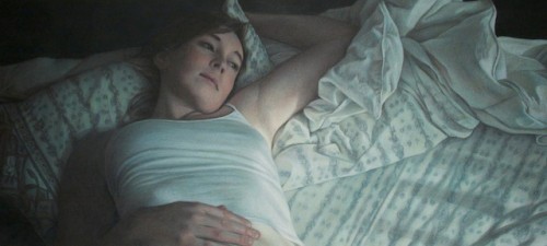
Moving into the home stretch. I need to refine the sheet pattern on the right, then start putting in the fine details, including the final darks and lights. Maybe I'll finish it next weekend!
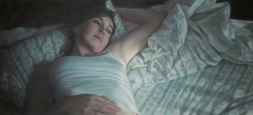
This weekend I turned a corner on the picture, and hit the point where everything is drawn and I can focus on pushing in color and building value. The pattern on the pillow is still giving me trouble, but strangely the pattern in the sheets is coming together on its own. I decided to hit the piece with a layer of fixative before continuing work early today, because it was getting pretty waxy and difficult to see how dark some areas were. I'm always a little nervous about doing that too early, because the paper becomes slicker overall, but it seemed to work okay. I also encountered the usual paradox where my darks didn't seem dark enough, but in actuality I needed to make all of my lights lighter.
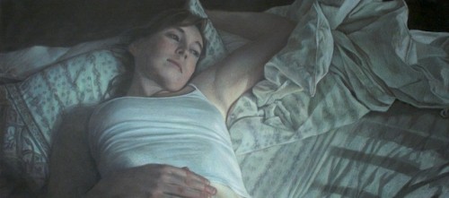
Slow going, but steady progress. The pattern in the sheet is going to drive my bonkers, but I feel the angles and lines it makes really add to the movement of the composition. I think I'm happiest with how the hand turned out - I was worried about the foreshortened hand being front and center, but that part went actually surprisingly easily. The lower right hand portion of the picture still has the least amount of work done, just with blocking and a few glazes of jade green to color correct. You can see the pattern of wrinkles in the sheets starting to form.
I've been working steadily on the piece that I prepared the swatches for in one of my previous posts. The finished piece will be a panoramic 26" w x 12" H on Aubergine Colourfix paper. If it turns out well, it will be one of my submissions for this year's CPSA show. I love to draw twists, turns, and folds in fabric, and this piece has plenty of it! Most of my work so far has been on the figure, and with different stages of blocking in for the fabric. On the flat portion of the sheet on the right there's just basic geometric shapes right now where the wrinkles and shadows are, but the crumpled comforter is fully blocked in and has some initial refinements, and I've started adding details closest to the figure.
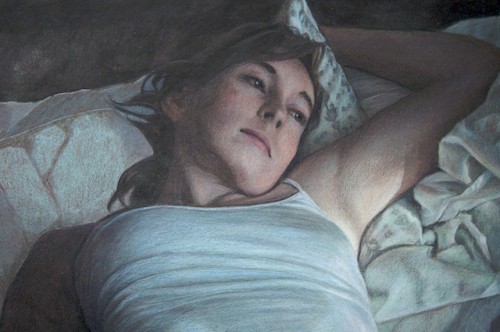
I'm just getting underway on a new piece. It has an interesting panoramic crop, which is somewhat different for me, with a final planned size of 26" W x 12" H. I'll be working on my favorite paper, Colourfix, in a color that I haven't used much: Aubergine (usually I work on Storm Blue or Fresh Gray). The first step is always to pick my palette, and I like to do this by laying down swatches of color on scraps of the actual paper I'll be using. I'll then keep this beside the picture throughout the process for reference. Once I have the swatches, I'll whittle them down to a dozen or so colors and place those colored pencils into a working tray. Sometimes I use an empty Prismacolor tin as my pencil caddy.
Here's a scan of my swatches for this piece. They're organized by color groups, and within each color group by values. It's also nice to see all of the colors together to get a feeling of the overall color harmony. I'll post more work in progress pics as the piece moves along.


