Blog

The Artwork of Shawn Falchetti
Posts in Behind the Scenes
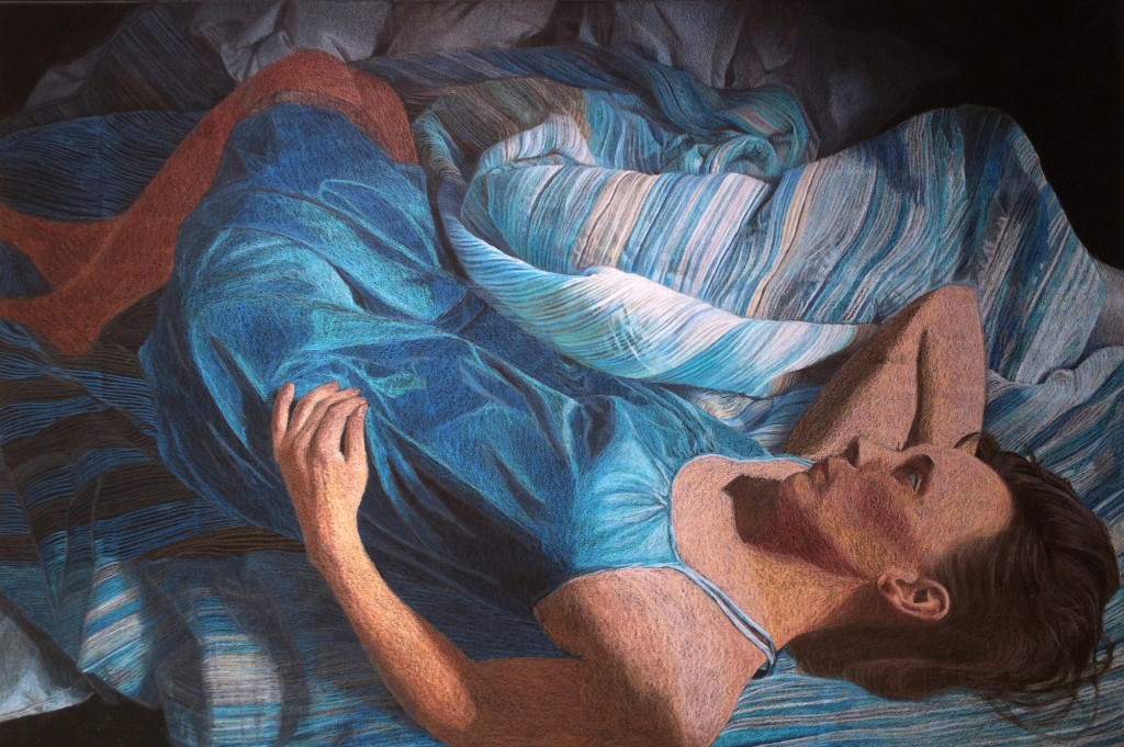
Daybreak Progression: 50 Hours in 30 Seconds

I created as short time lapse video of the work in progress photos from "Daybreak". You can see my process for this piece was:

  1. White line drawing on black paper
  2. Foundation layers for the background
  3. Worked the skin tones from brightest to darkest areas
  4. Worked the shadows
  5. Brought up the lights and refined the fine details

Thanks for watching!

Stuck on You

Each year the CPSA national show is hosted by a different gallery.  It's been fun traveling around the US for the shows over the years, visiting places like San Francisco, Washington DC, Seattle, Cinncinati, and Daytona.  Artists ship their artwork about a month before the show, and CPSA hires a cartage company to manage unboxing and handling of the 120+ works.  Since the cartage company must physically be located near the gallery, a different one is used every year. I received my first hint that something was up when I logged onto my computer a few weeks ago.  A few dozen emails from the colored pencil artists Facebook group were in my inbox, and growing.  The hot topic was triggered by the return shipments of our artwork from the Daytona show.  Works were arriving back with stickers applied to the front plexi of the piece.

The mishap seems to have occurred due to good intentions.  At the Daytona show, the gallery placed stickers with the artist's name and work title on the gallery wall beneath the piece.  If the piece won an award, they placed a second sticker with the award information as well.  I can guess that the person from the cartage company thought the artists might want their show stickers and stuck them to to the plexi.  He probably didn't realize that they would be extremely difficult to remove.

Sure enough my piece arrived with both stickers on the plexi:

IMG_0876-333x500.jpg

At the show I noticed some wax bloom developing on the legs in the drawing, and planned to take apart the frame when it arrived to fix it.  The presence of the stickers didn't upset me too much since I thought it would be easy enough to remove once the plexi was out.  With a little effort I removed the hanging hardware, dust jacket, framer's points, and finally the artwork:

I read about various approaches to removing the stickers, and decided to go with the least aggressive:  good old soap and water.  I filled up a utility sink with hot soapy water and let my plexi soak in it for a few hours.  i was tempted to light some scented candles and play some spa music to complete the experience:

IMG_0883-333x500.jpg

And several hours later:

Hmmm. Okay, on to the aggressive methods.  Surprisingly the best thing for removing adhesive without damaging the plexi is WD40, although getting the WD40 residue off afterwards is difficult.  As I am scrubbing away to remove the residue I juggle the plexi, drop it, and irreparably gouge it on a sharp edge on my work table (I really should have put a towel under it to protect it from scratches).  Not a little gouge, but a Grand Canyon sized crevice.  Since there's no fixing this, I make the phone call to my framer to order a new piece of plexi.

In the meantime I check out the wax bloom.  You can see it as a light gray on the outline of the left leg.  I find that they darker Prismacolor warm grays are prone to bloom, and this is an area where I outlined the legs before laying down color.  It's bloomed pretty good.

IMG_0889-500x333.jpg

Fortunately this is easy to correct with a slightly damp cloth, followed by a layer of fixative.  I don't particularly want to pull the entire mat apart, so I mask it off with paper before spraying the fixative on the artwork:

IMG_0900-500x333.jpg

It takes about a week for the plexi to come in.  It is just as expensive as the first time I bought it (doh!).  I peel off the protective paper, carefully (!) lay it into the frame with a towel underneath, then pull out my handy point gun and set the framer's points (as an aside, you can set points without a point gun, but seriously, if you do your own framing splurge for at least a cheap one.  It takes me abut 20 seconds to put all the points back in on this piece).

My framer used brown craft paper for the original dust jacket, but I usually use Lineco frame backing paper, so I cut some for the replacement before reattaching the hardware.

CPSA published a note to the artists indicating they were compiling an artwork handling guideline list for future cartage companies.  I think this is a good step, and will help.  I think some artists are seeking damages from the cartage company, but I am not (the sticker was easy to remove with WD40; the damage was my own fault, and I had to take the plexi off anyway to fix the wax bloom).  Live and learn!

Details, details

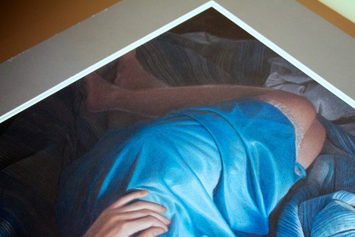
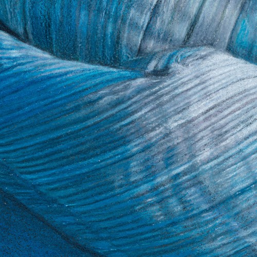
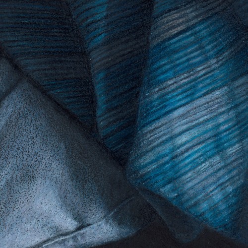
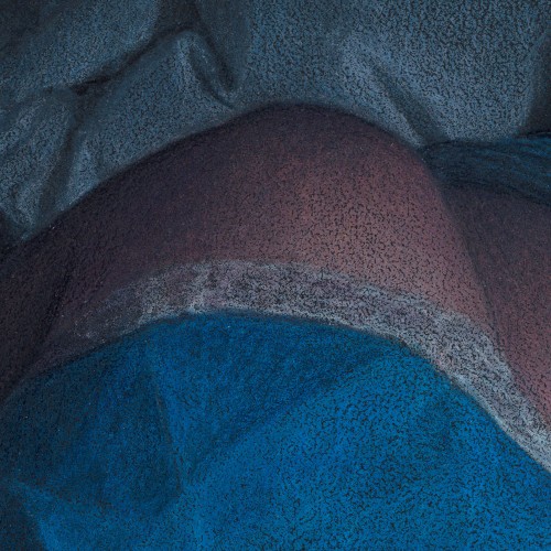
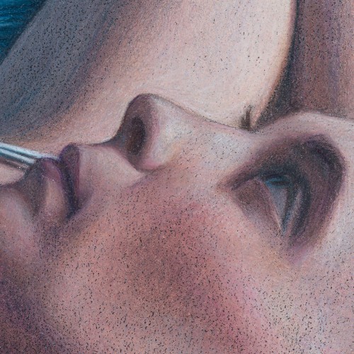
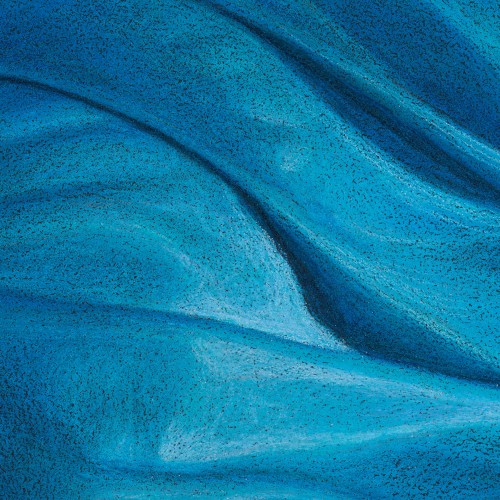
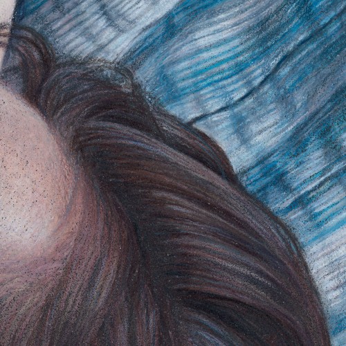
So, if you couldn't guess from the title of this post, it's about....details.  A 28" drawing  condensed into 6" on a computer screen can look photorealistic, but if you look at it full sized you can see the pencil strokes.  I like the pencil strokes (and there were a lot of them in this piece!), so here's a few close ups: Folds and wrinkles in the upper portion of the blanket

Folds and wrinkles in the shadow area of the blanket and comforter

Lace along the fringe of the gown

Facial features

Folds in the gown

Hair direction with blanket wrinkles in the background

Work in Progress Nov 3

A few more hours of work on the upper background (near the top border of the picture), focusing on the folds of the white comforter.  As the darker values are defined in this area, it helps make the lighter areas of the blanket look brighter.  I also began working some of the brighter values in the blanket folds.  As whites are introduced, you can start to get a feel for skin tones, which will need to step up several value levels.

IMG_2740

Color Guide

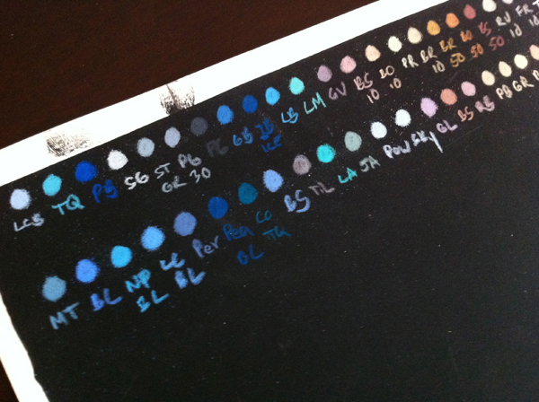
Continuing on with the prep for my new project, I took the selected colors and made a color guide by arranging them in small labeled swatches and running the color right to the end of the paper.  I'll keep this handy as a reference when doing the drawing to pick colors: final palette

Taking a Leap

Today I started working on the largest piece to date, measuring at 28.75" x 19".  Previously the biggest piece I could do was 27" x 18", since this was the largest sheet of ArtSpectrum Colourfix paper I could buy.  Canon Mi-Teintes Touch papers come is 22" x 30", and once you subtract the non-printed border the 30" dimension decreases to 28.75", so this is my new maximum width. Once I have the composition and lighting all worked out, one of the first steps is picking my palette.  I always do this on a piece of the same colored paper I intend to use, and like to scribble little circles of color similar to paint daubs.  If I've got a pretty good feel for what colors will be used, I'll lay the daubs down grouped by hue and value.  Underneath each I'll write an abbreviation for the color so I know what it is, and if I am using pencils from multiple manufacturers I'll do a different row for each.  In the photo below I did Caran d'ache Luminance in the first row, and Prismacolor in the second.

IMG_2466

Note the black paper in the photo is Artspectrum Colourfix, which I happened to have a scrap handy.  One of my complaints about the Colourfis paper is the mix of quality issues I'd had with their screen printed area, such as the black splotches visible on this one.  I've had no issues like this with the Canson Mi-Teintes Touch.

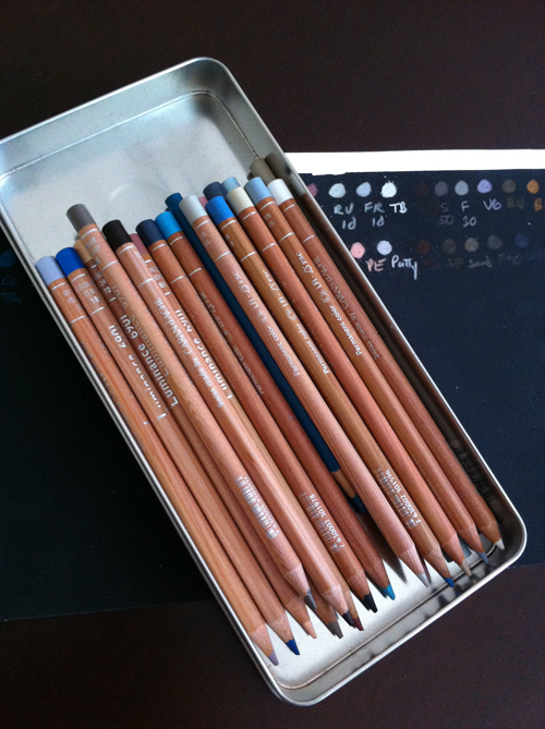
The trick now is to pick out only the colors I need, since the piece will have better overall color harmony that way.  Since I recently purchased a full set of Caran d'ache Luminance pencils, I've also been eager to try a piece with mostly Caran d'ache just to try them out.  So, here's the roster of what made the cut:

Caran d'ache:

001 White 009 Black 185 Ice Blue 755 Gray Blue 171 Turquoise Blue 508 Paynes Gray 504 Paynes Gray 30 507 Paynes Gray 60 093 Violet Gray 808 French Gray 802 French Gray 10 803 French Gray 30 872 Burnt Ochre 10 842 Raw Umber 10 862 Burnt Sienna 10 866 Burnt Sienna 50 046 Cassel Earth

Prismacolor

Cobalt Turquoise Sky Blue LIght

I placed all of them in a handy tin, and set them beside my table.  This way the palette is ready with all of the colors within reach, and also portable if I want to work on a drawing board instead of the drafting table.

IMG_2468

The Mystery Continues

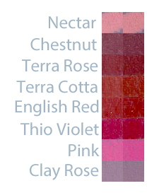
The last few drawings of mine have ended in small disasters.  After spraying the piece with a moderate coat of Krylon Workable Fixative (which I've been using for years), I've scratched my head and wondered if a gremlin had snuck in, grabbed a red pencil, and run amok on the picture:  an intense, reddish purple had appeared in multiple areas. Since this has occurred in skin tones and hair, I suspected one of the reddish browns was reacting with the fixative and bleeding.  Fixative is part solvent, after all. I slipped on my lab coat (figuratively) and decided to conduct an experiment with a before and after fixative scan. As it turns out, none of my suspects were guilty.  None bled as a result of the fixative.  But - I've always known that my colors darken as a result of applying fixative, so I thought it would be interesting to set the results side by side to see just how much.  The swatches are on Canson Wineless Mi-Teintes Touch paper (my new favorite color!), and the pencils are Prismas (because that's the main brand I use):

You can see all of the colors darken noticeably, with Nectar and English Red having the least change.  Some of the colors, like Pink, both darken and allow more of the paper color to show through.  Something to keep in mind when applying fixative.

Canson Mi-Teintes Touch

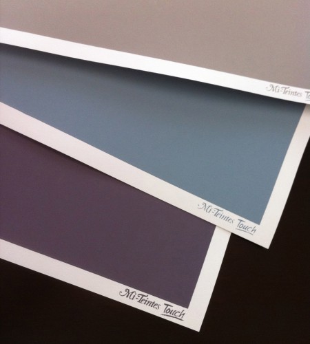
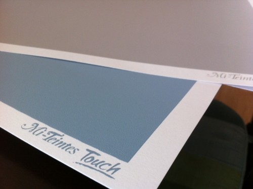
Everyone now and then I like to google "sanded papers" to see if any new products are out.  Most of my artwork is on Artspectrum Colourfix paper, with a few pieces on Pastelbord and Fisher 400.  I've tried UARTs and Wallis, and they didn't work for my style.  I've always liked drawing on the Canson Mi-Teintes papers in the past - especially the multi-colored tablets that give you a variety of hues - but these were textured (but not sanded) papers.  Some colored pencil artists (Sue Obaza comes to mind - check out her work in Strokes of Genius 2) do amazing things to bring out the texture of the Mi-Teintes paper; for me, though, I love the pumice in primer effect of Colourfix, and the speckled finish it produces.  You can imagine my delight when my google search found Canson Mi-Teintes Touch papers.  I had to order some! The Mi-Teintes Touch look and feel very similar to Colourfix.  There is a white, unprinted border around a colored, printed area which is toned with a fine grit sandpaper feel.  The available colors are many of the same colors in the usual Mi-Teintes line up (which is awesome!).  Here's my personal assessment of how they compare side by side with Colourfix:

  • Mi-Teintes full sheet sizes are slightly larger (22" X 30") vs. Colourfix's (18" x 27").
  • Dick Blick's website offered 14 colors for Mi-Teintes, vs. 20 colors for Colourfix
  • For the 3 sheets I ordered (Light Blue, Flannel Gray, Twilight) of Mi-Teintes, the colors were a little more vibrant and saturated than Colourfix colors, which tend to be subdued.
  • The Mi-Teintes papers have the "Mi-Teintes Touch" logo screen printed in the white border of each sheet, while Colourfix borders are unprinted
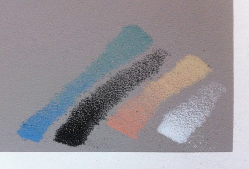
  • The tooth feels similar to the touch between Mi-Teintes and Colourfix.  A few test scribbles showed it to be slightly more prominent in the initial layers than Colourfix.
  • The most striking difference (and this is my biggest complaint about Colourfix in general) is in the overall quality of the screen print area.  The 3 Mi-Teintes sheets all had perfectly rectangular printed blocks of color, with no splatters, no chips, and no irregularities.  The color was uniform in each block.  Running my hand across the surface, the grit was uniform in each block.  From my experience with Colourfix, the variability is high both for consistency of grit and quality of the screen print area.  Some pieces of Colourfix have very little grit, and others are more like sandpaper.  Colors often have splatters and small voids.  The printed edge border is somewhat irregular (which I actually kind of like).  It has been frustrating to buy a pack of Colourfix paper and have every sheet have some type of printing defect, though.  It was nice to have 3 perfectly uniform sheets of Mi-Teintes.  I'll be curious to see if this is the norm with Mi-Teintes as I try more sheets.


Here's a few pics of the sheets and some test scribbles.  Now I just need to figure out what my first project will be!


Measure Twice, Cut Once

With only six weeks to go until the arrival of our daughter, the nursery is shaping up nicely.  After the baby shower in January, it's filled with baby gear: more types of blankets than I know what to do with; adorable hats with ears; changing tables and hampers, video baby monitors, and lots of tiny outfits.  I'm especially happy with all of the hand made items in the room:  there's the needlepoint blanket my mother made for us, the needlepoint prayer Kiersten's mother made for her nursery when she was a baby, some heirlooms from Kiersten's family, original artwork bought from one our of DC115 CPSA member's show (Nan Bozenka's beautiful cone flowers), and of course the room itself, which Kiersten and I laid the floor for with our own two hands.  
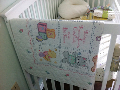
In keeping with the handmade theme, it was only natural to browse Etsy for some of the other decorations, and we settled on three prints by GalerieAnais.  The prints came as 8" x 10" prints, unframed, so I thought this would be another chance to put a personal touch in by framing and matting them in my studio.  When we painted the nursery, we didn't yet know the gender of the baby, so we chose a blue/green wall color.  Since learning we would be having a girl, I've been trying to sneak some pink into the decorations.  Because of this, I thought the prints would look great with a white frame, warm white outer mat, and pink inner mat.  Since I'm used to framing and matting my own artwork, I didn't think the double mat would give me too much trouble.  After spending the better part of a Saturday afternoon destroying multiple mats, I thought I'd write a post about some tips from what I'd learned.

Cutting double mats actually isn't difficult as long as you don't cut corners (no pun intended!):

  1. Step 1: Cut new outer edges on your top mat to ensure they are square.
  2. Step 2: Actually use the stops on your mat cutter to set the bevel cut distance.  This will ensure everything's parallel and at a set distance.
  3. Step 4: Cut the outside dimensions of the inner mat a little smaller than the top mat (about 1/2" smaller on each side).  This will ensure the only edges used for measuring and squaring will be the top mat's.
  4. Step 5: Stick the bottom mat to the top mat using double-sided tape (with the cutout still in place) .
  5. Step 6: Increase your mat cutter stops by the inner border thickness, plop your taped mat in place, and cut the bevels for the inner mat.  Ta-da! The taped together cutouts should fall out.  Everything will be perfectly aligned, centered, and at uniform thickness.

So, you can probably guess that I did the opposite of almost every step the first two attempts, before doing it the right way.  The main two places I went awry were assuming my staring materials were square, and not using my mat cutter stops (instead, I drew lines which ended up being non-parallel).  When you only have a 1/4" inner border, even a small degree of non-squareness will result in a visually noticeable thin border at one end of the cut which fattens up at the other.  Anyway, thought I'd share my experience - maybe it will save someone else a little frustration when cutting double mats!

Here's the final piece, framed and matted, on the wall in the nursery (the artwork in the picture is by GalerieAnais on Etsy):


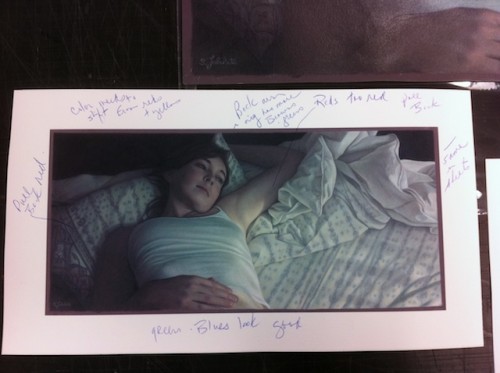
Lizza's

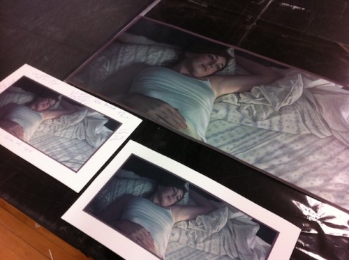
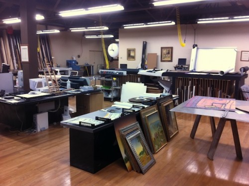
Today I finalized the proof of "Daydreams" at Lizza's Studios.  I've been selling prints of some of my work for a while, and Lizza's always does the scanning and giclee prints for me.  Additionally, I use their scans for my CPSA show submissions, since their professional scans look 1000% better than what I can accomplish with either a photo or pieced together scan on my home computer. They own a Cruse CS285 ST scanner, which is larger than a pool table, and after scanning they work with me to meticulously color match every area of the print.  When I first started working with them, it usually took three to four proofs until a perfect match, because the sandpaper texture of my paper combined with the high glare of the fixative created some interesting challenges.  Now, they've become experts at scanning my work, and it will either be perfect on the first shot, or require only one markup.  Once I frame the print, usually the only way I can tell it from the original is by tilting the drawing and looking for the 3d bumps of the sandpaper grit; otherwise, it fools even me!

Behind the Scenes - Opaline Dreams

Opaline Dreams was interesting in that it was my first attempt at mixing Prismacolors with Neocolor IIs, which are water soluable.  Neocolors look much like a Crayola crayon when you hold them (although they are still considered a colored pencil - imagine the 'lead' of a colored pencil wrapped in paper, instead of wood).  It takes a bit of experimenting on a test scrap of paper to determine the right combination of crayons to achieve your color, especially since, once you wet them, the color will be very intense.  For this piece, I intended to use the Neocolors only for the darks; this was because I really felt the gray green color of the Colourfix paper was a key part of the skin tones and fabric, and wanted it to show through in the lights.  Since Colourfix can be difficult to get a full range of values on, having solid darks on a lighter paper also helped address this. After the Neocolors were laid down on the paper, I brushed water over them and blended them over the paper.  For the darkest area on the right, I used a very small brush and meticulously evened out the tone.  For the hair, and darks on the right, I used a larger brush and more freely 'painted' with the water.  The result was fuzzy, and uneven, which is what I wanted.  It gave the periphery of the piece a softness that was in line with the mood.

The remainder of the piece was straight Prismacolors.  I spent the most time on the folds and lace of the gown, although it was the skin tones that I found to be the most difficult area, since there was a constant push and pull between going too far in one color and not enough in another.  I tend to end up with an unusual mix of colors in my skin tones, and this one was no exception with greens, purples, and creams.

Swatches

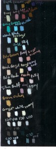
I've just started working on a new piece, and snapped a photo of one of my favorites parts of the process - working out the color palette.  If possible, I'll lay down the swatches on scrap pieces of the actual paper I'm using (in this case, black Colourfix).  If I like the color, I'll put the pencil aside into my "palette box" for the picture.  Hopefully I'll also remember to label the color - something I don't always do when I'm rapidly trying many colors - so I can reference it later on.  It's also a nice sanity check to look at all of the colors in the piece at once as swatches - if they have good harmony, then I'll feel more confident about how the final picture will look.  Here's the pic of the working palette for my new piece: palette-med

Behind the Scenes - Haven

Haven was done on violet blue Colorfix paper. I envisioned the skin tones being filled with blue, and the woman's face being nearly silhouetted against the light of the window. I wasn't quite sure how to handle such a dark blue picture, but I thought I'd figure it out as I went along. I've put together a progression of the drawing from start to finish so you can see how I tackled it:

The skin tones start with a base of Clay Rose, and then get multiple overlays of blues, purples, and a touch of dark brown. The highlights are Powder Blue. The warm light which catches the tendrils of her hair is Ginger Root, and overall her hair is a mix of blue and purple for the darks, pink for the midtones, and Ginger Root for the lights.

behind-haven