Blog

The Artwork of Shawn Falchetti
Posts tagged mi-teintes touch
Work in Progress - Sep 30 2013

A while ago I wrote a post about selecting a palette for my next piece, which will be completed on a full sized sheet of Canon Mi-Teintes Touch black paper using Caran d'ache Luminance pencils.  The palette looks like this: final palette

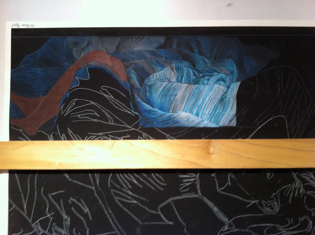
I'd previously transferred the line drawing and had the picture mounted on my drawing board ready to go.  Today I got a few hours to put pigment to paper.  Usually I work all areas of a piece at once, progressing through basic colors and shapes to more refined details, saving elements like patterns or lace for last.  For this piece, though, nearly the entire work is a pattern, so I am working the pattern as I go along, section by section.  Non-pattern areas are getting basic value and colors blocked in at this stage, and once I have the entire piece blocked in I will begin refining and building up the colors layers.

The pattern is a wonderful challenge, along with all of the fabric folds, but it's also a bit like drawing hair: what's important is the direction and framework be in place; the rest I can draw in during refinement.  The shadow areas, for example, are single lines on bare black paper.  The highlight areas are fairly refined, but this is a focus area which will influence value choices for the figure, so I worked ahead on this section some to figure out some color and value combos.
IMG_2641

Sunrise

I completed my first piece on Light Blue Canson Mi-Teintes Touch, titled "Sunrise", using Prismacolor and Luminance colored pencils.  I really liked the color of the paper and decided to include a 1" border of bare paper around the piece, signing it in the border like I would a print.  I enjoyed working on the Mi-Teintes Touch.  The texture of the paper was prominent in the first few layers, and in a few places I let it show through heavily.  In other areas, such as the sunlit hair and window, I was able to saturate the paper with colored pencil and achieve a good range of values.  The grit was very even and allowed for nice, uniform layering and transitions of colors in the background.  I think the light blue color is a nice choice for portraits and figures - it has just the right mix of blue with a touch of green.  One other thing I liked about the paper: the weight.  At 353 gsm, it's a little more than 50 gsm heavier than Colourfix paper, and has a nice feel to it.  There's something about heavy art papers that I love.

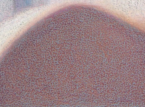
Here's a detail of the shoulder area, where I let plenty of the paper's texture show through:

A detail of the background transitions and texture:

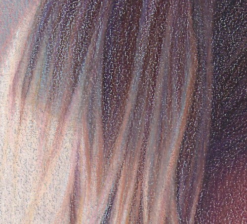
And a detail of the hair:

Canson Mi-Teintes Touch

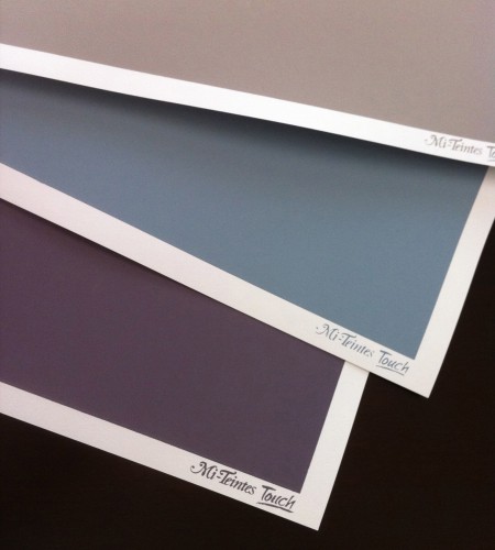
Everyone now and then I like to google "sanded papers" to see if any new products are out.  Most of my artwork is on Artspectrum Colourfix paper, with a few pieces on Pastelbord and Fisher 400.  I've tried UARTs and Wallis, and they didn't work for my style.  I've always liked drawing on the Canson Mi-Teintes papers in the past - especially the multi-colored tablets that give you a variety of hues - but these were textured (but not sanded) papers.  Some colored pencil artists (Sue Obaza comes to mind - check out her work in Strokes of Genius 2) do amazing things to bring out the texture of the Mi-Teintes paper; for me, though, I love the pumice in primer effect of Colourfix, and the speckled finish it produces.  You can imagine my delight when my google search found Canson Mi-Teintes Touch papers.  I had to order some! The Mi-Teintes Touch look and feel very similar to Colourfix.  There is a white, unprinted border around a colored, printed area which is toned with a fine grit sandpaper feel.  The available colors are many of the same colors in the usual Mi-Teintes line up (which is awesome!).  Here's my personal assessment of how they compare side by side with Colourfix:

  • Mi-Teintes full sheet sizes are slightly larger (22" X 30") vs. Colourfix's (18" x 27").
  • Dick Blick's website offered 14 colors for Mi-Teintes, vs. 20 colors for Colourfix
  • For the 3 sheets I ordered (Light Blue, Flannel Gray, Twilight) of Mi-Teintes, the colors were a little more vibrant and saturated than Colourfix colors, which tend to be subdued.
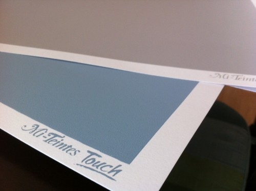
  • The Mi-Teintes papers have the "Mi-Teintes Touch" logo screen printed in the white border of each sheet, while Colourfix borders are unprinted
  • The tooth feels similar to the touch between Mi-Teintes and Colourfix.  A few test scribbles showed it to be slightly more prominent in the initial layers than Colourfix.
  • The most striking difference (and this is my biggest complaint about Colourfix in general) is in the overall quality of the screen print area.  The 3 Mi-Teintes sheets all had perfectly rectangular printed blocks of color, with no splatters, no chips, and no irregularities.  The color was uniform in each block.  Running my hand across the surface, the grit was uniform in each block.  From my experience with Colourfix, the variability is high both for consistency of grit and quality of the screen print area.  Some pieces of Colourfix have very little grit, and others are more like sandpaper.  Colors often have splatters and small voids.  The printed edge border is somewhat irregular (which I actually kind of like).  It has been frustrating to buy a pack of Colourfix paper and have every sheet have some type of printing defect, though.  It was nice to have 3 perfectly uniform sheets of Mi-Teintes.  I'll be curious to see if this is the norm with Mi-Teintes as I try more sheets.


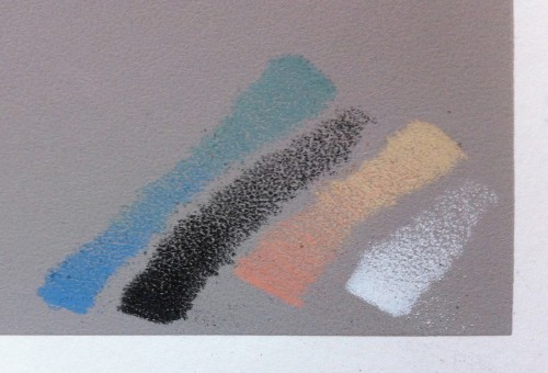
Here's a few pics of the sheets and some test scribbles.  Now I just need to figure out what my first project will be!