Blog

The Artwork of Shawn Falchetti
Work in Progress - Milestone Reached

Completing a colored pencil drawing can be a bit like running a marathon, and this has been especially true for this one.  Today I hit a milestone, and in honor of it I have a perfect running clip:


One of my favorite parts of that clip is when Clark gets a bit winded and you can just see him realize this seemed much easier in his head, but he pushes past the thought and charges on.

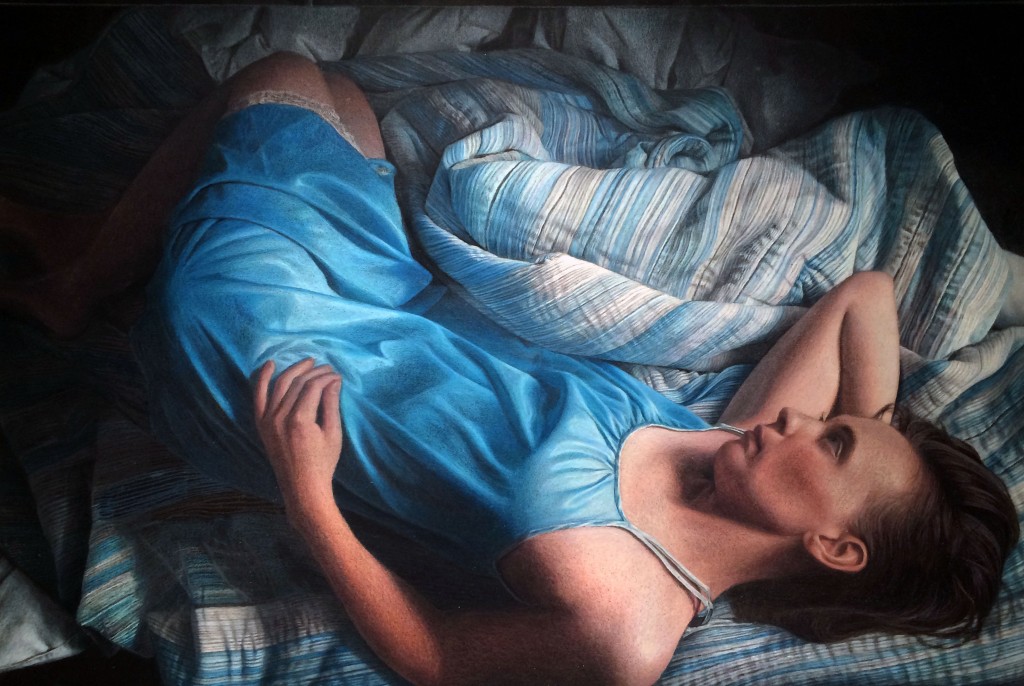
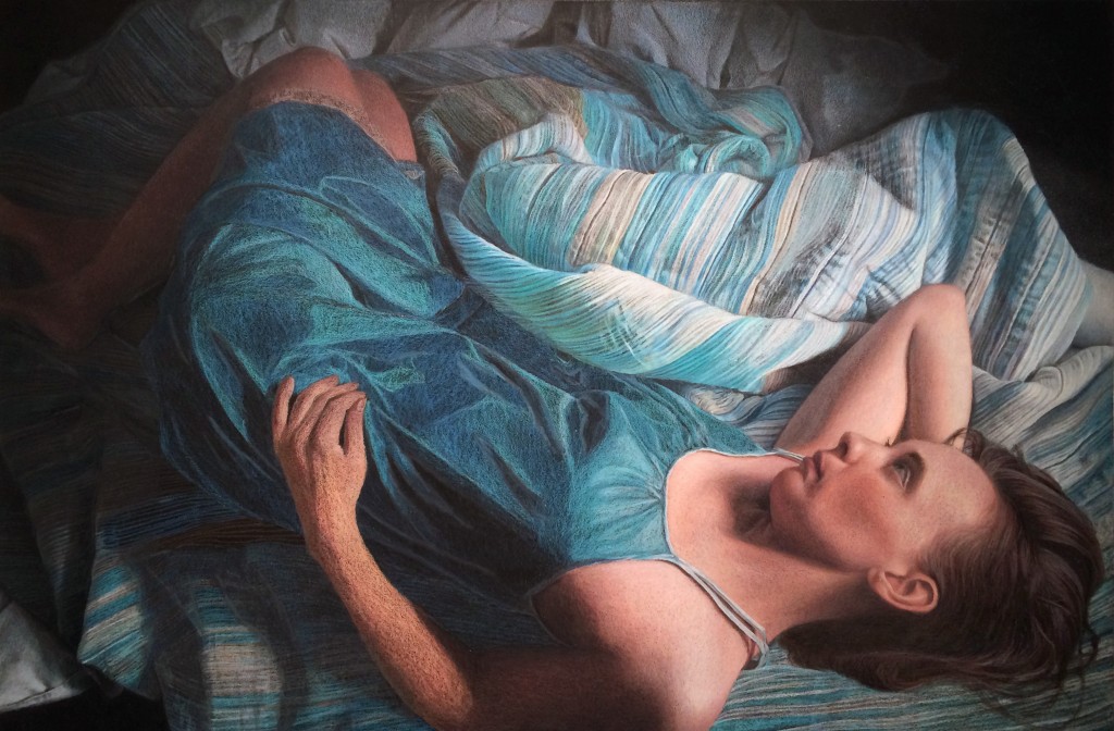
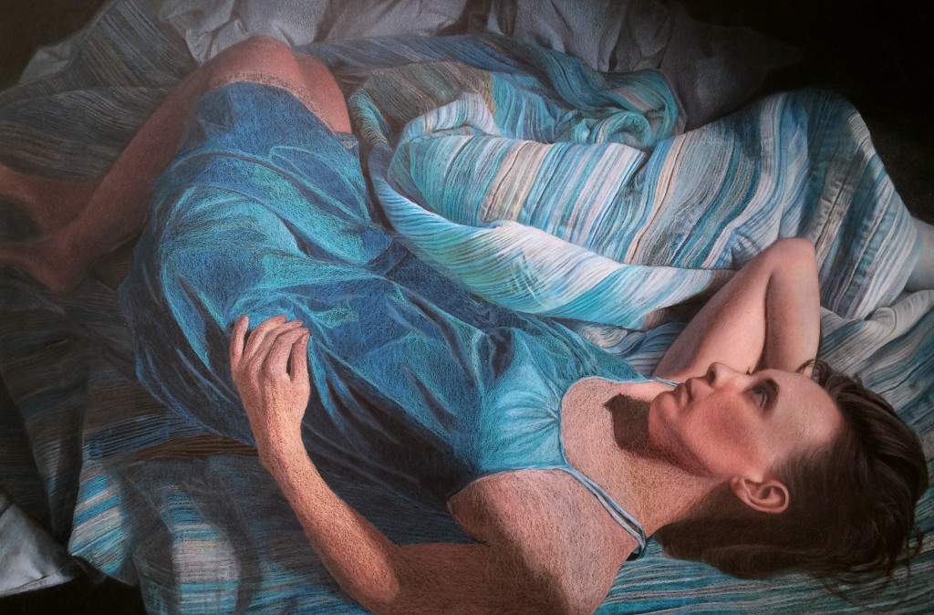
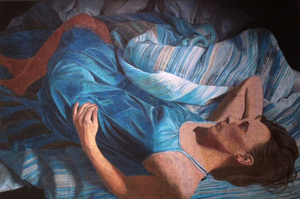
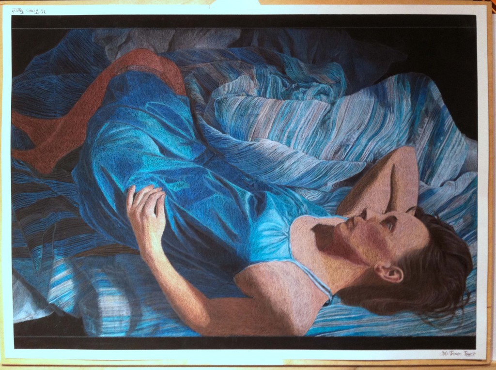
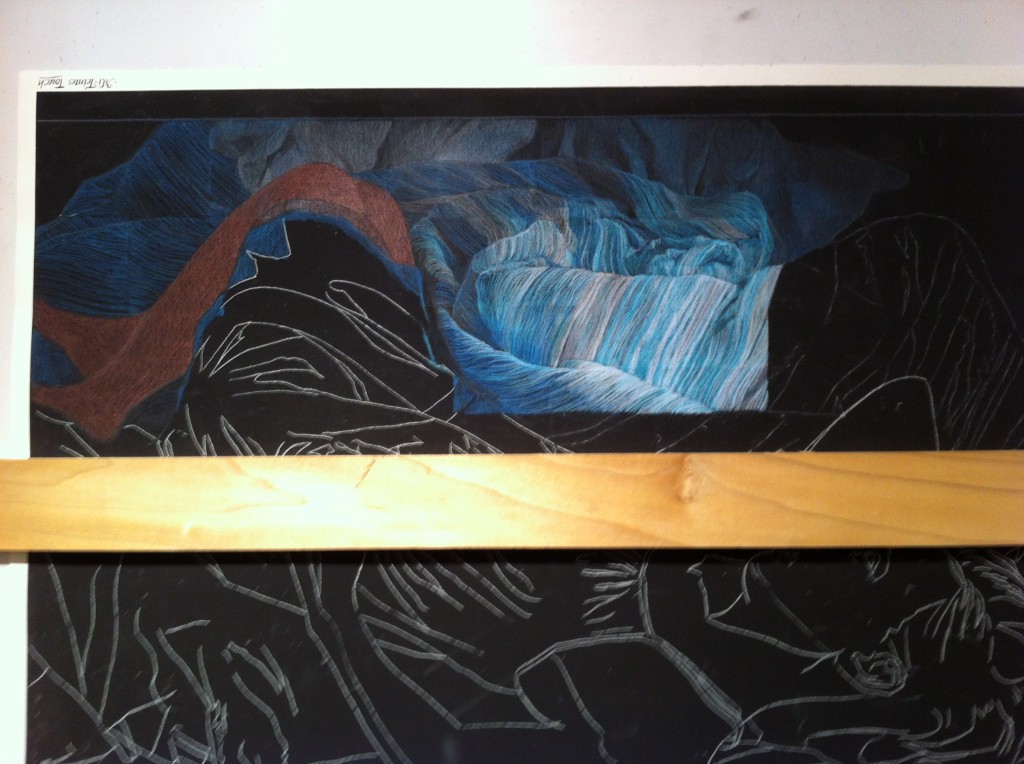
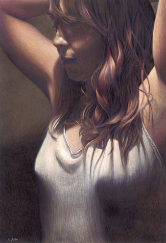
So, here I am at my milestone on the largest and most complex drawing I've done.  The entire work is drawn now and at a fairly high level of refinement.  The next phase is my favorite: balancing color and values, which really adds life to the piece.  I find it fun because the framework is complete, and I can loosen up and more freely put pigment on paper.

A few things on the docket:

  1. Incorporating some blues into the skin tones.  Skin is very reflective and picks up local color.
  2. Incorporating some warms into the blues of the nightgown.  The gown is reflective and picks up the brightly lit skin.
  3. Refining the left arm and hand.  Values still need to be pushed a few steps, and mid tones developed.
  4. Refining the legs in shadow.
  5. Refining the wrinkles in the upper portion of the work.  I learned a lot about drawing the wrinkles as I progressed clockwise, and I'll apply what I learned to the earlier wrinkles.
  6. Refining the hair.  I love drawing hair, and there's always lots of color that can be added.

Here's the work in progress pic:

Work of Progress Jan 2
Work in Progress Dec 30 2013

I've been busily continuing to work the blanket folds and wrinkles, completing the right side and most of the bottom of the drawing.  The bottom left is unworked and will be next.  I'm looking forward to completing the blankets, so I can move on to the overall refining of the piece.  This is a fun phase where I can add color and contrast, really bringing some areas to life. A while ago I wrote a post about color matching, and I caused myself some rework by not following my own rules: I switched photo references.  When I started the piece, my reference was printed on my home printer, which tends to skew colors towards green.  Later I had a full sized reference printed through Apple's Aperture print service, which had colors true to my color calibrated monitor.  Since I had drawn many of the top blankets using the first reference, they were skewed towards green  Using an electric eraser I was able to lift some of the green areas, but the blankets closest to the figure needed to be completely stripped off with the eraser and redrawn.  Now that it's complete, I'll return to focusing on the bottom left side of the drawing.

Work in Progress 12 30 2013

Work in Progress - Dec 24 2013

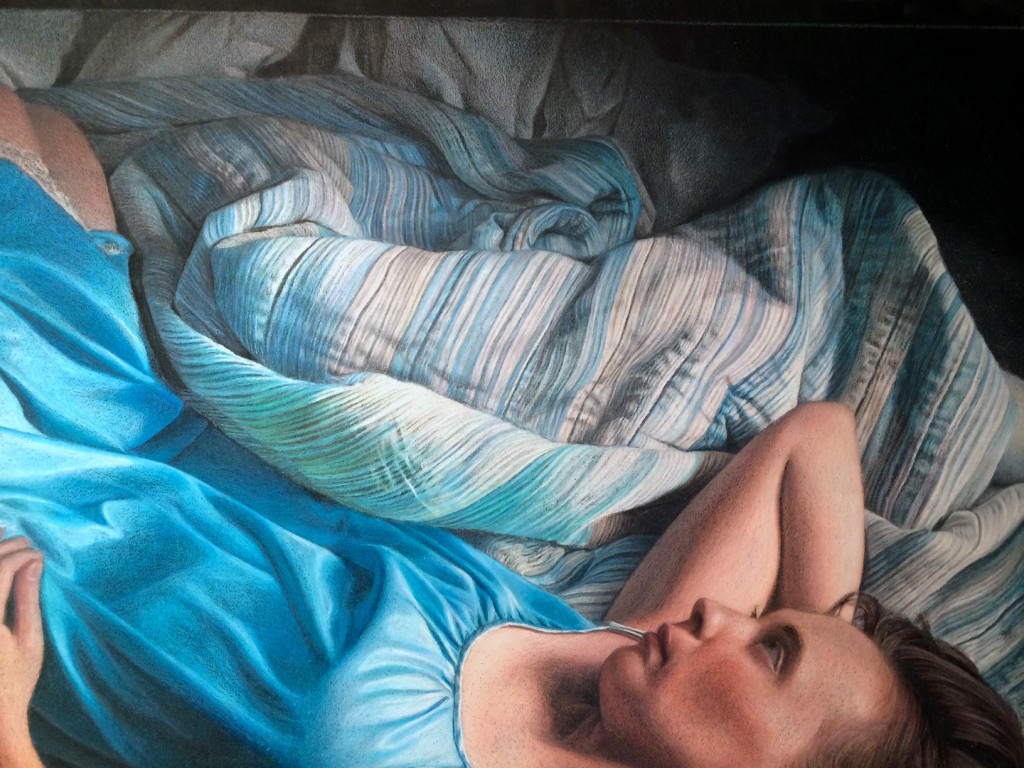
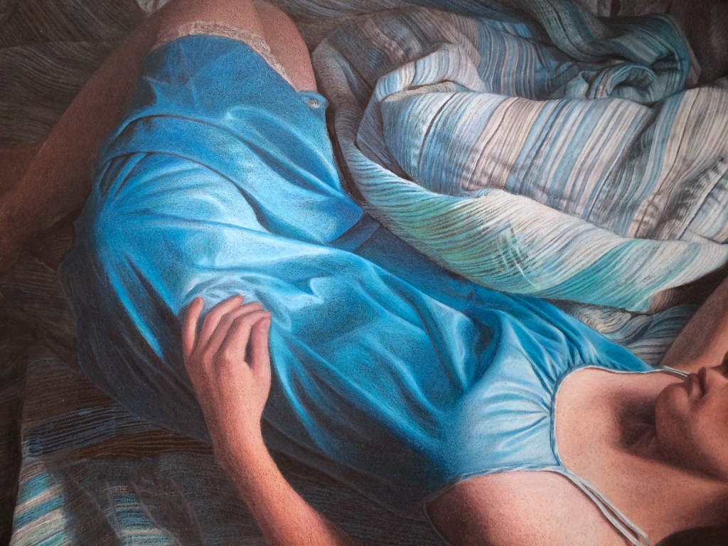
Happy Holidays!  I've been taking some of my vacation time around the holidays to continue refining my work in progress.  I've been steadily moving from right to left in the upper blanket folds, fixing mistakes and adding detail.  Sometimes it feels like I'll never finish the blanket folds, pattern, and wrinkles - there's so much detail and it's slow, meticulous work, but I think it's really starting to shape up.  Next I'll begin working clockwise to refine the blanket folds until I'm working in the shadow areas of the piece. Blanket Detail

Nightgown Detail

Work in Progress - November 27 2013

Another 7 hours of work today, filling in more flesh tones and continuing to refine the blanket near the elbow.  As I've been moving from right to left, I've been correcting both the pattern, value, and in many cases the color of my first pass.  With the values refined for the right-most blanket and the arm and face skin tones, you can get a sense of the strong light direction from the upper right, and how the left side of the picture will unfold IMG_2817

Work in Progress - November 26 2013

Several more hours of work, and I've begun refining some of the blanket folds, working all around the piece before moving into some fine detail on the right side of the blanket. I have to admit, at times I feel a little over my head working the blanket pattern, and I just need to take a break from it. During those breaks I've started working the skin tones for the legs, right arm, and head. I'd just like to say that I love the Caran d'ache pencils for skin tones, mainly because several of their colors are skin tones, and you don't need to create them using the familiar pink-orange-yellow layering. It certainly speeds up things. Now that I've put the Caran d'ache through their paces, here's a few observations:

Caran d'ache Luminance pencils (76 color tin):

  • Superb quality control.  All leads perfectly centered, pencils sharpen well, points don't snap.
  • Pencil diameter is slightly larger than standard.  If you have an adjustable pencil sharpener, no problem (on mine it is one click bigger than standard).  On my old Xacto sharpener, which was not adjustable, I couldn't fit the pencils in without jamming them with force.
  • Pigment feels "drier/more powdery" when applied, especially to sanded paper.  It lays down evenly.  "Less waxy" is perhaps more accurate.  Leads feel harder than Prismas, but not as hard as Prisma Verithins.
  • Different colors have different hardness/waxiness.  This is the case for all colored pencils I've used, regardless of brand.  You just get to know the feel of different colors.
  • Expensive!  Okay, I knew that before starting, but yikes!  I'm on my fourth refill of some colors already for this picture, at $4.03 per pencil open stock
  • A bit hard to reorder.  No one sells them locally, and even ordering them online via Dick Blick periodically has colors out of stock, which can bring working on a piece to a standstill
  • Colors in the 76 pencil set were well chosen and compliment each other nicely.  You could almost grab random colors from the set and still have a nice color harmony, because the colors are a bit subdued.  The set is very heavy in blues, grays, and fleshtones, so it is perfect for me.  It's a bit sparse on greens and reds, though.  I feel I'd need to supplement the set with other brand's pencils if I were working with those two colors.

Here's a snapshot of the work in progress. My next steps are to finish the skin tones on the upper body, and continue refining the upper blanket folds moving right to left.

Work in Progress November 26

Marquis Art and Frame Show Update
There was a great turn out Friday night at the Marquis Art and Frame group show artist's reception.  The show was hung in two rooms in the 2nd floor gallery of Marquis Art and Frame, and my work appeared in the second room.  It was great to see some old friends, and meet some new.  Here's a few pics from the reception:
Marquis Art and Frame Group Show

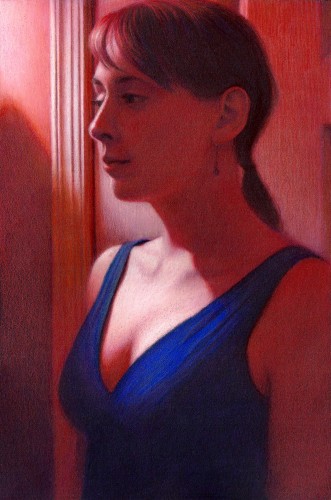
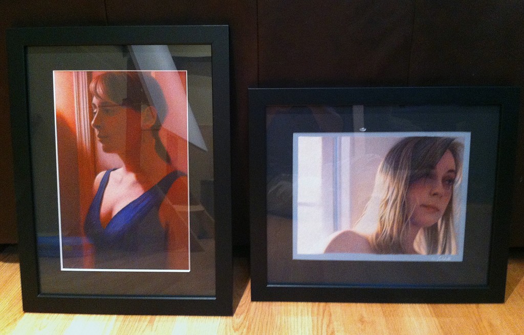
Today I dropped off my artwork for this Friday's group show, "The Art of Colored Pencil" at Marquis Art and Frame.  The show includes colored pencil artwork from Nina Davidowitz, Edy Kishbaugh, Barbara Baker, Tammy Greear, Mary Lou Steinberg, Sabine Thomas, Charles "Woody" Woodworth, Mary Beth Lesko, Linda Keck, Carol Colestock, Georgiana Cray Bart, Tom Stapleton, and myself.  My two pieces are "Sunrise" and "The Red Room, Revisited".  Show info is:

Artist's Reception

Friday, November 15, 2013, 5-8 pm

122 S Main St Wilkes-Barre

Show runs Nov 15, 2013 - Jan 4, 2014

Sunrise

The Red Room, Revisited

Work in Progress Nov 3

A few more hours of work on the upper background (near the top border of the picture), focusing on the folds of the white comforter.  As the darker values are defined in this area, it helps make the lighter areas of the blanket look brighter.  I also began working some of the brighter values in the blanket folds.  As whites are introduced, you can start to get a feel for skin tones, which will need to step up several value levels.

IMG_2740

Happy Halloween 2013

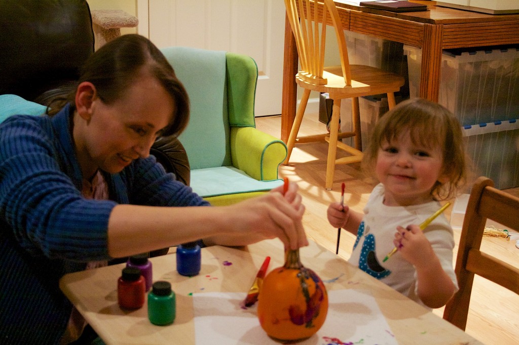
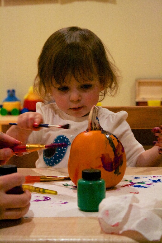
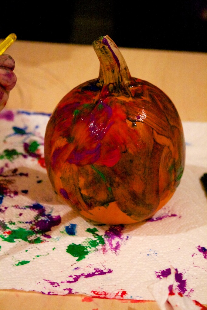
This weekend we carved our pumpkins.  When we went to the pumpkin farm to pick them out, Emma also picked out a small one for herself, and today she painted it (her first painting project in the play room!): IMG_6283

IMG_6294

IMG_6316


Happy Halloween!

Work in Progress – Oct 6 2013

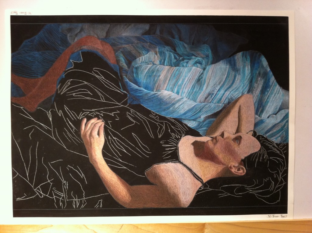
I've got the main colors blocked in for the entire piece, and I've really been grinding through pencils.  I already placed another order for some of the turquoise colors, which will arrive later this week.  There's a few shadow areas with bare black paper showing on the left, but the pattern is penciled in.  This entire area of the picture will be much darker than it is now and I realized I was probably going to end up stripping off some pigment if I blocked it in solid now, so I'll wait until the other values are refined before working this area. It's a bit of a relief having all of the folds and pattern stripes mapped out.  This will let me focus on filling in the colors and values next.

IMG_2656

Work in Progress - Oct 1 2013

Today I put another 7 hours of work into my current project. I was surprised yesterday how quickly I went through my first few pencils. I'm used to the sanded papers really devouring my pencils, but I had somewhat underestimated the usage of the bedspread colors, and in no time I was down to pencil stubs. In fairness, the paper width is 28.75″, and the same four colors have been used constantly. Since they are Caran d'ache Luminance, no one sells them open stock locally, so I had to order them from Dick Blick. This also meant that, today, when I used up my last stroke of blue, I needed to switch gears and focus on a different part of the picture until my order arrives. I decided to block in the base colors for the fleshtones: IMG_2643

One of the other quirks of being home today is that it was just me and the cat, Iggly. There's a series of cartoons called "Simon's Cat" that any cat owner will love, and this one sums up trying to do artwork with a cat:

[embed]http://youtu.be/uOHvZjiDANg[/embed]

Work in Progress - Sep 30 2013

A while ago I wrote a post about selecting a palette for my next piece, which will be completed on a full sized sheet of Canon Mi-Teintes Touch black paper using Caran d'ache Luminance pencils.  The palette looks like this: final palette

I'd previously transferred the line drawing and had the picture mounted on my drawing board ready to go.  Today I got a few hours to put pigment to paper.  Usually I work all areas of a piece at once, progressing through basic colors and shapes to more refined details, saving elements like patterns or lace for last.  For this piece, though, nearly the entire work is a pattern, so I am working the pattern as I go along, section by section.  Non-pattern areas are getting basic value and colors blocked in at this stage, and once I have the entire piece blocked in I will begin refining and building up the colors layers.

The pattern is a wonderful challenge, along with all of the fabric folds, but it's also a bit like drawing hair: what's important is the direction and framework be in place; the rest I can draw in during refinement.  The shadow areas, for example, are single lines on bare black paper.  The highlight areas are fairly refined, but this is a focus area which will influence value choices for the figure, so I worked ahead on this section some to figure out some color and value combos.

IMG_2641

Chalk it Up

With a bit of active imagination, it's quite easy to imagine that everything you've ever misplaced has not been lost, but instead has fallen through a crack in reality only to land in a great collection of junk in some subterranean room.  It turns out the entrance to that room was through a door in my kitchen, down a flight of bare wood stairs, and into a dank cinder cap walled basement.  At least it was until 2009, when we decided "medieval dungeon storage room" was not the right design direction for the basement.  If this were a tv show, there'd be an awesome time lapse montage showing stacks of 2 x 4's turning into framed walls while contractors flash in and out of frame, ladders appearing with electricians installing lights, panels of drywall coloring themselves in rolled on swathes of paint, and the final reveal of the basement turned studio.  Since it's just a blog point, though, I'll show the start:  

Stairway Wall Before

and the end:


Studio

Four years of me at my table drawing and Kiersten at her loom weaving have given us our money's worth for the space, but now in 2013 the room has hit another evolutionary branch.  Each day as we navigate the Wipeout style baby toy obstacle course that our living room has become, we think how great it would be to have a little more space, or, at the very least, a playroom.  After a flurry of consolidating and baby proofing, we've started updating the studio to have a play area.

Emma's hit the stage where she loves crayons, and we're always trying to intercept her as she takes one and heads towards a wall.  This is why it was a particularly great idea of Kiersten's to paint a chalk board panel on one of the walls.  A trip to Lowe's readily found the can of chalkboard paint, a roll of Frog tape and some rollers, and we were good to go.  This past Saturday I masked out the space and put pigment to wall.

Chalkboard paint looks like a slightly thicker than normal bluish black paint.  You roll it on with a roller, discover it doesn't really stick the same way as paint, then get artistic with your application patterns trying to move around heavier blobs to cover swiss cheese splotches, and finally let the first coat dry enough that you can hit it with a second coat.  All of this was happening during the magical time to get things done known as Emma's Afternoon Nap.  1.5 hours into it I had finished the second coat and was starting the clean up, with hands filled with paint covered pieces of Bounty, paint can lids, mixing sticks, and a roller and paint tray.  Glancing at the baby monitor to see Emma still snoozing,  I thought, hmmm....this went smoother than expected - glad the cat was also napping the whole time.

Almost on cue I felt something furry brush past my ankle. I looked down at Iggly.  He looked up at me, then looked over at the black wall and you could just see him thinking, hey, what's this now?  and swooshed his tail into the paint.  Suddenly alarmed that it was both wet and sticky, Iggly turned into an orange streak in an apparent attempt to outrun the paint that was stuck on his tail.  This resulted in his tail acting like a paint brush, leaving black curved lines of paint on the floor randomly as I chased him with my armful of paint supplies.

There's a internet meme named "Pink Shirt Guy" which I love.  Words won't do it justice, so here it is:
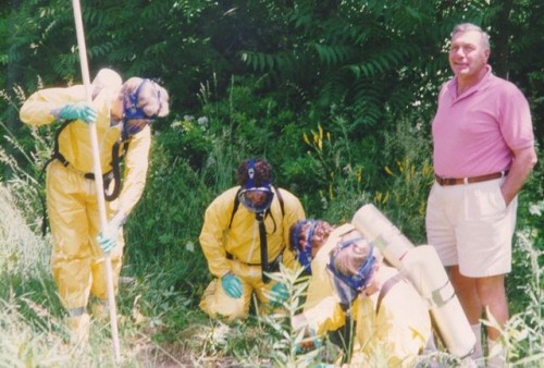
pink-shirt-guy

I'd love to know the story behind this photo.  I've seen it posted in inspirational poster format with the caption, "Curiosity: Whatcha doin?". I'm pretty sure if Iggly were human, he'd be Pink Shirt guy.

Kiersten arrives home with the groceries to find me circling our now black tailed cat around the dining room table in a strangely choreographed dance, and after some joint tackling we thoroughly soap his tail clean.  A few hours later I head back downstairs to peel off the Frog tape and check out the final result:

Chalk board panel

Cool.  Now we just need to wait  a few days for it to completely dry, rub it with some chalk the first time to prime it, and start doodling.  We've got a toddler height section for Emma, and a higher section for her parents.  The remainder of the studio is still available for us to do our hobbies while Emma is playing in her area:

Play area (in progress)

Art studio area

Sewing area

Strokes of Genius 6

I'm excited to announce that "Cascade" has been accepted into North Light Books Strokes of Genius 6: Value | Lights & Darks. I really love the Strokes of Genius Books, which showcase artists of different drawing media, ranging from charcoal and graphite to ink and colored pencil. The complete list of accepted artists can be found at: http://www.artistsnetwork.com/medium/drawing/strokes-6-winners. Checking over the list, I see many of my fellow colored pencil artists, including Gloria Callahan (Harley’s Davidson), Deborah L. Friedman (A Zen Little Drawing), Tanja Gant (Waiting; Speak No Evil), Linda Lucas Hardy (Her Eyes So Blue; Repose), Elizabeth A Patterson (Tomato Bullseye), and Bill Shoemaker (Rosie’s World).


CASCADE | 27" x 18" (68.5cm x 46cm) Colored pencil on sanded pastel paper

NewsS.D. Falchetti Comments
Framed

Today I finished framing "The Red Room, Revisted" and "Sunrise", two pieces which will be hanging in the November group show at Marquis Art and Frame.  Usually  I use white or light gray mats, but for these I went with dark mats - black for "The Red Room, Revisted" and a dark, cool gray (if it were a Prismacolor pencil I'd say Cool Gray 90%) for "Sunrise".  Both pieces will be for sale in the show. IMG_2551

Website 2.0

I've consolidated my blog and portfolio to a single site, www.shawnfalchetti.com, and updated the design to have a cleaner layout with some nice typography and plenty of breathing space for the blog content.  One of the interesting technical aspects is that I'm using Wordpress as a true content management system, serving up all of the static web pages as well as the blog content.  This means updating the static content (exhibitions page, etc) has become much easier because I can use Wordpress' content editor, instead of opening up Dreamweaver and editing HTML.  Hope you like the update!

MusingsS.D. FalchettiComment
Family Tree

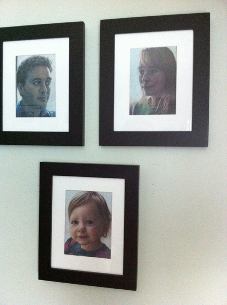
Some projects have a way of creating themselves.  Quite a few years ago my local CPSA branch had a member show which included a self portrait project.  It was a fun idea where all of the artists bios were next to their respective portraits.  I created a little 5" x 7" drawing on Pastelbord, and I still use it as my avatar on my bio page and blog. A few years later, in 2008, I got married and thought it would be a cool idea to draw an identical portrait of my wife, Kiersten.  We recreated the same pose and lighting, but looking the opposite way, so when the portraits were set together they would form a cameo.  The two framed drawings were on the table at our wedding reception with our guest book.

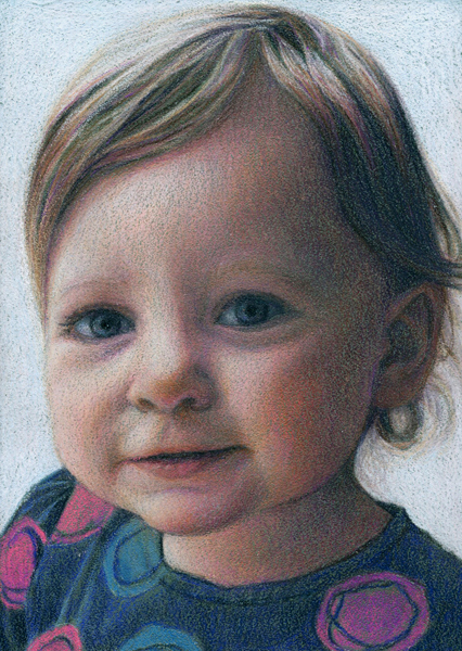
Zip on over to 2013, and we've got a beautiful toddler bouncing around.  So, of course, the natural next step was to do another 5" x 7" in the same format of Emma and add it to the cameo.  After thinking about the moody, blue palette of the first two, I decided to take a bit of artistic license and brighten up the palette as well as more directly light Emma.  Here she is, along with the three pics together:

Emma Small

IMG_2495

Color Guide

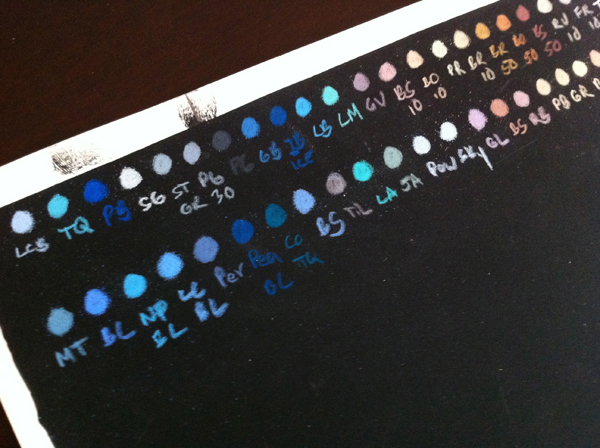
Continuing on with the prep for my new project, I took the selected colors and made a color guide by arranging them in small labeled swatches and running the color right to the end of the paper.  I'll keep this handy as a reference when doing the drawing to pick colors: final palette

Taking a Leap

Today I started working on the largest piece to date, measuring at 28.75" x 19".  Previously the biggest piece I could do was 27" x 18", since this was the largest sheet of ArtSpectrum Colourfix paper I could buy.  Canon Mi-Teintes Touch papers come is 22" x 30", and once you subtract the non-printed border the 30" dimension decreases to 28.75", so this is my new maximum width. Once I have the composition and lighting all worked out, one of the first steps is picking my palette.  I always do this on a piece of the same colored paper I intend to use, and like to scribble little circles of color similar to paint daubs.  If I've got a pretty good feel for what colors will be used, I'll lay the daubs down grouped by hue and value.  Underneath each I'll write an abbreviation for the color so I know what it is, and if I am using pencils from multiple manufacturers I'll do a different row for each.  In the photo below I did Caran d'ache Luminance in the first row, and Prismacolor in the second.

IMG_2466

Note the black paper in the photo is Artspectrum Colourfix, which I happened to have a scrap handy.  One of my complaints about the Colourfis paper is the mix of quality issues I'd had with their screen printed area, such as the black splotches visible on this one.  I've had no issues like this with the Canson Mi-Teintes Touch.

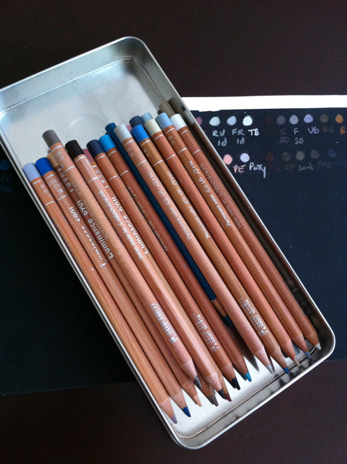
The trick now is to pick out only the colors I need, since the piece will have better overall color harmony that way.  Since I recently purchased a full set of Caran d'ache Luminance pencils, I've also been eager to try a piece with mostly Caran d'ache just to try them out.  So, here's the roster of what made the cut:

Caran d'ache:

001 White 009 Black 185 Ice Blue 755 Gray Blue 171 Turquoise Blue 508 Paynes Gray 504 Paynes Gray 30 507 Paynes Gray 60 093 Violet Gray 808 French Gray 802 French Gray 10 803 French Gray 30 872 Burnt Ochre 10 842 Raw Umber 10 862 Burnt Sienna 10 866 Burnt Sienna 50 046 Cassel Earth

Prismacolor

Cobalt Turquoise Sky Blue LIght

I placed all of them in a handy tin, and set them beside my table.  This way the palette is ready with all of the colors within reach, and also portable if I want to work on a drawing board instead of the drafting table.

IMG_2468